WorkCase study
Skincare that explains itself. An identity built to feel premium without ever feeling out of reach.
- Client
- VedaZuri
- Year
- 2026
- Category
- Branding
- Services
- Brand strategy, Logo, Packaging, Brand guidelines, Logo animation
01 / The challenge
The challenge.
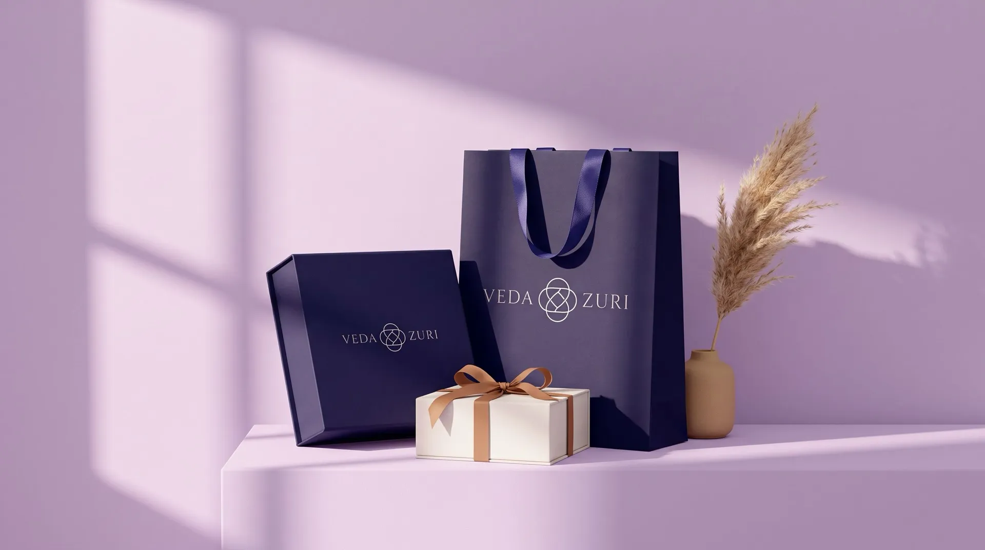
Skincare is confusing, and brands that look expensive tend to make it worse. VedaZuri does the opposite: it explains and it guides. The identity had to signal quality while staying warm enough for someone buying their first serious product, and hold up at every size, from a sticker on tissue paper to the front of a shopping bag.
02 / The approach
The thinking.
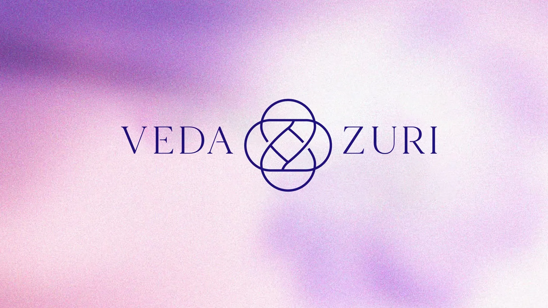
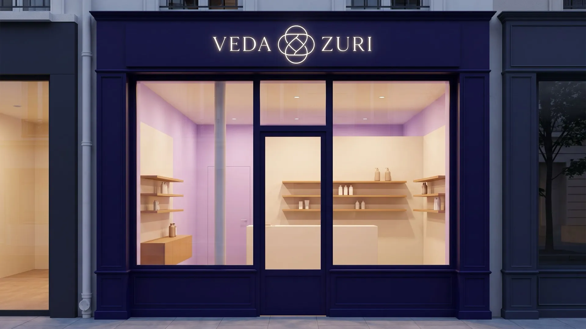
Start with one mark and let everything follow. Overlapping circles form a single unbroken line, with a V and a Z held at the centre. Tall, elegant lettering sits beside it. Three colours carry the mood: deep indigo, soft lavender, warm tan. Calm, a little luxurious, never loud.
03 / The execution
The making.
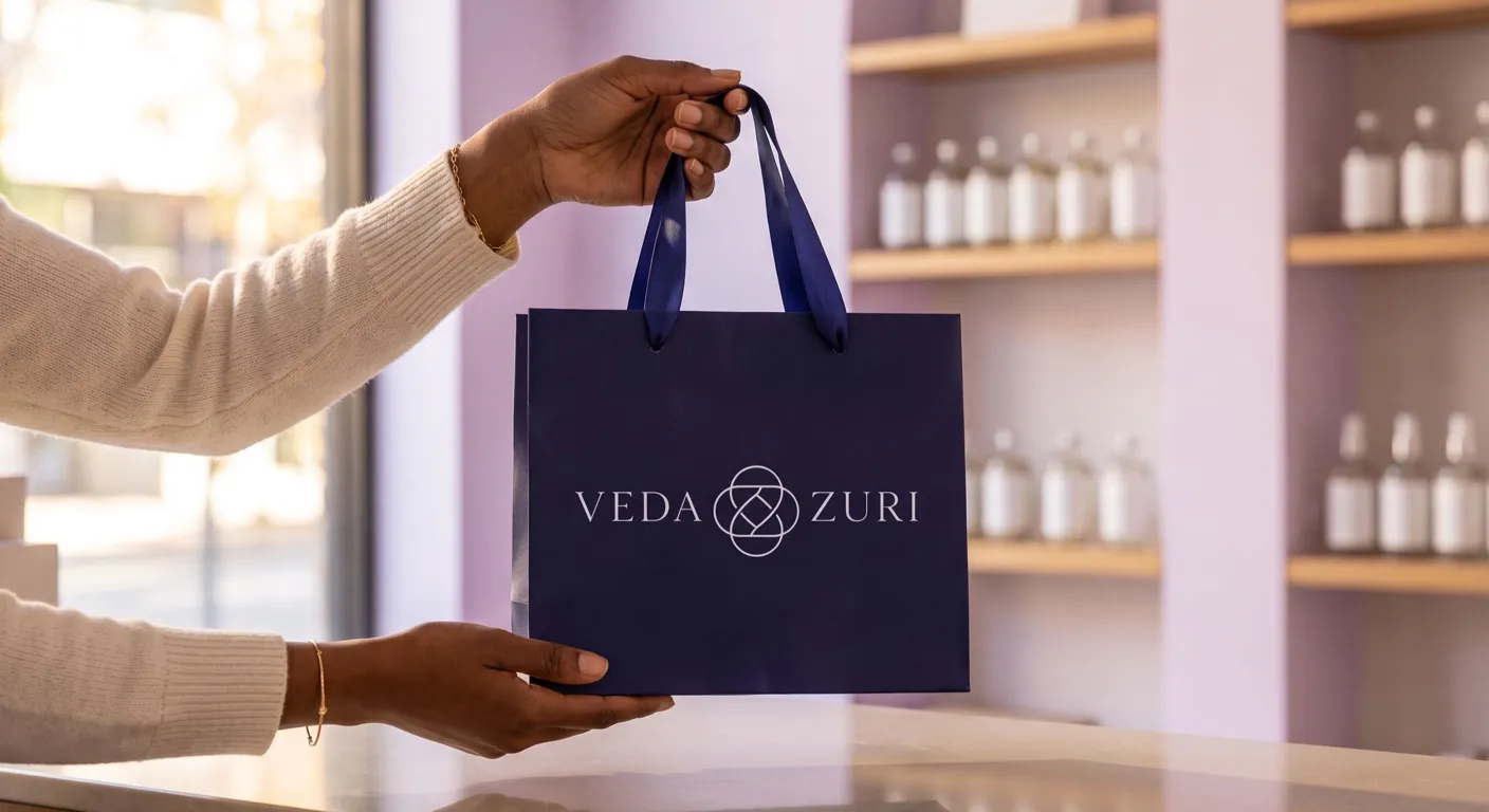
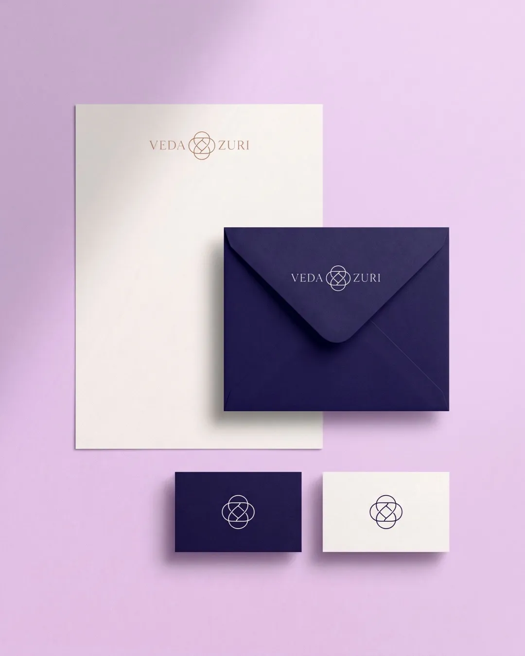
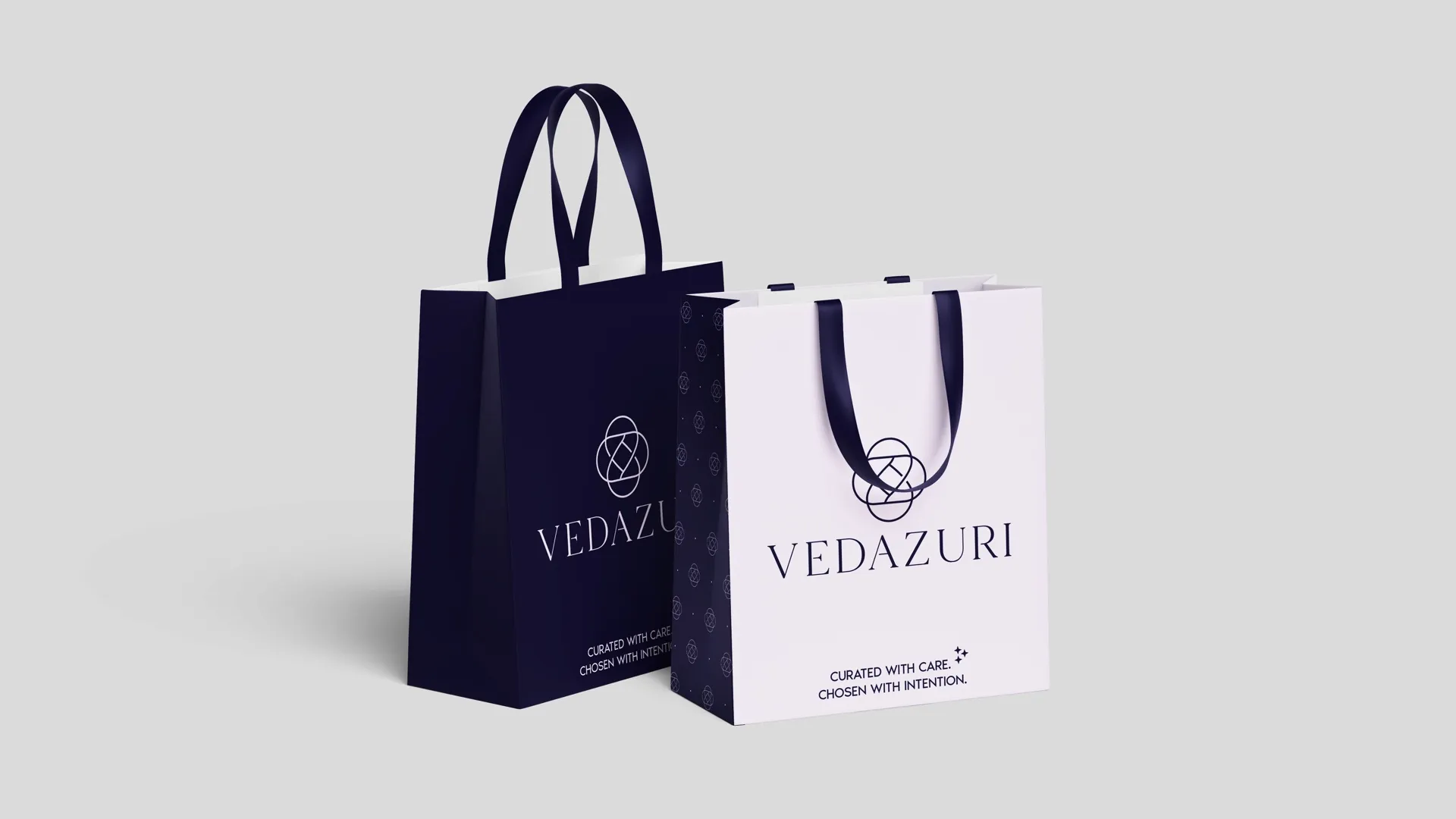
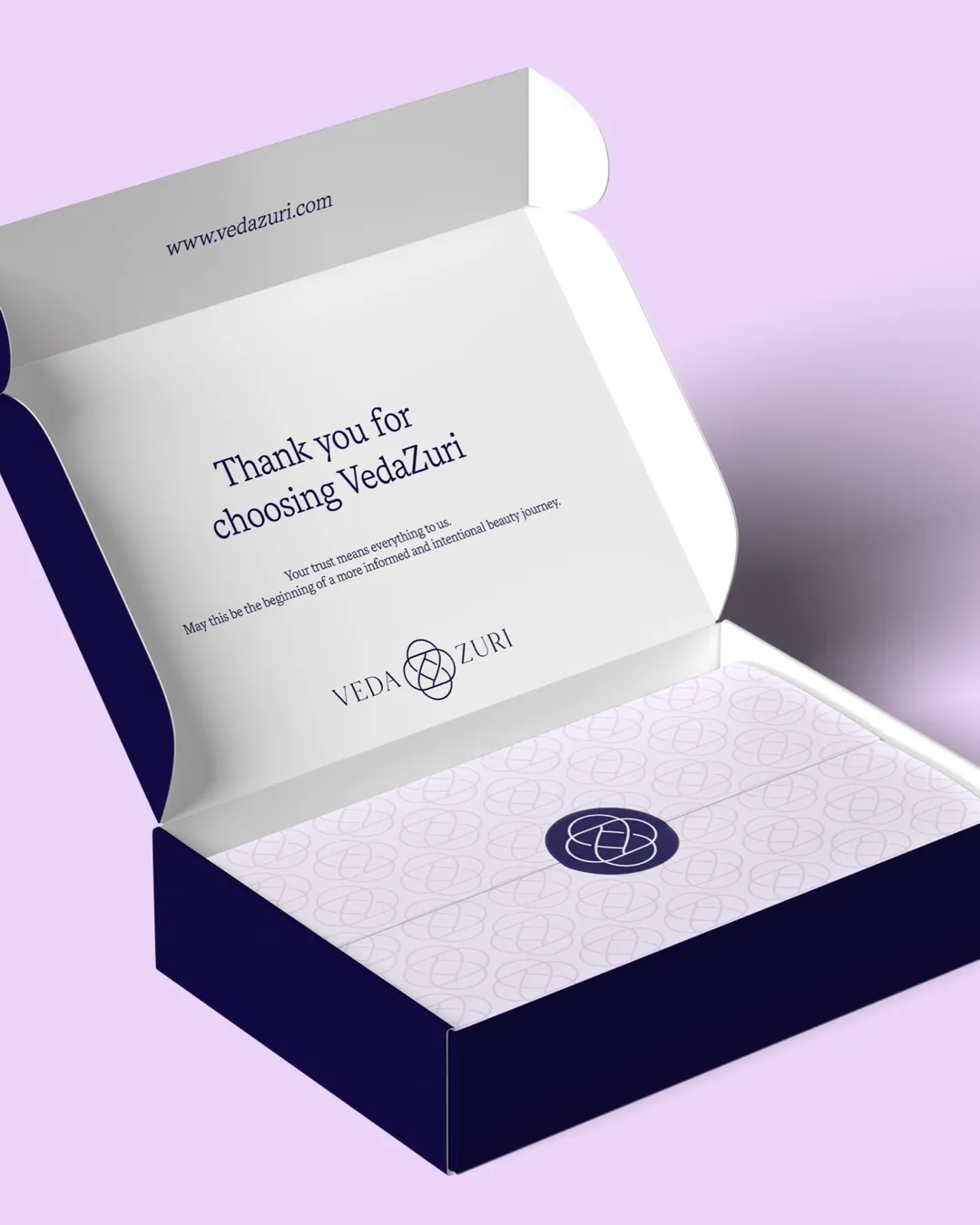
The system went onto everything a customer sees and holds: shopping bags, a delivery box with a thank-you note inside the lid, stationery, a tote. A short logo animation covers video and social. A plain-language guide to the logo, colour and type keeps whatever VedaZuri makes next looking like VedaZuri.

Next project
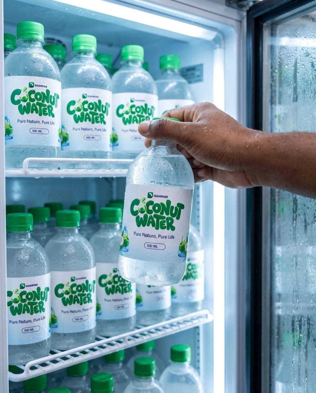
Dambwe Coconut Water
Have a challenge, an idea, or something worth building? Let’s talk.